INFO NIGHT | mid-year intake 2019

FORGE YOUR OWN PATH

“The question isn’t who is going to let me;

it’s who is going to stop me” – Ayn Rand

The design industry is continually expanding, and the range of career paths is diverse.
As our environment and technology changes around us, design is a constant.

Design is more than aesthetics.
It is the unseen bond between the elements that make sense of the world.
It is what makes a room feel right, or a website easy to navigate.

Design is humanistic.
It solves problems with critical thinking and creative solutions.
It uses technology as a tool rather than a driver.

Design is curious.
It questions, explores and plays.
It allows continual learning and discovery.


Join us for an awesome night.
Ask any questions you have about curriculum, dates, prices, career opportunities etc.

Monday 6th May
5.30pm – 6:30pm

Make sure you reserve your place by completing the RSVP form below.

2020 Info Night | Thursday 28 NOV 2019
Sending

INSTA CRUSH | iridescent kitchenware by essarai ceramics’

Crystals and ceramics – together at last! American artist Collin Lynch meticulously blends the two together to create a unique and colourful collection.  Inspired by nature and seeking to break the mould of conventional shaped kitchenware , Lynch crafts  quirky custom pieces from his home studio in Albuquerque, New Mexico.

Essarai Ceramics opens a door for whimsy, wonder and the curiosities of our childhood to reenter and re-inspire, enriching our lives through reminders that decorate ones home. Each piece is handcrafted with water, clay, hands and heart; each piece of wood, crystal or notch carved and strategically placed by Fate, where all things eventually fall into place.

Machines manufacture perfection- the stark white, flawless atmosphere created by mechanics and mathematics- a realm where the soul has been lost. We now live in a world where our aesthetics have adapted to a fabricated perfection, stunting the bud of creativity that is attempting to blossom.

The pieces sit in the middle between functional and sculptural. Geometric shapes burst from the side, making you feel like you are holding a collection of iridescent crystals – an exciting perk to your morning ritual!

Through my work, I seek to unveil perfection through imperfection, which is where Truth lies. Nature, being the most delicate yet enduring example of this paradox, is where through the rough surfaces and shattered angles, we are reunited with ourselves.

Essarai Ceramics’ products are inspired by and named for specific stones like Amethyst and Smokey Quartz. The range is available in a variety of colours to choose from, and also the option to custom order if you are looking for a specific hue.

INSTA @essarai_ceramics
SHOP Essarai Ceramics’

BREAK THE MOULD | graduation 2018

On Friday the 11th of January we came together to celebrate our Graduates of 2018.

HDS encourages bold and disruptive design that is produced once a deep understanding of traditional design values are met. You must first learn the rules to break the rules!

Staying true to traditional design practices does not mean they are left in the past. HDS is a forward-thinking institution and proves to show consistent adaptation to their courses to incorporate new technologies, which equips their students with a broad skill set.

With this mindset, a dynamic learning environment is created and student’s creativity and experimentation results in ideas that BREAK THE MOULD.


Achievement Awards

STUDENT OF 2019
Carly Cousins | MSF40113 Certificate IV in Interior Decoration

TOP OF THE CLASS
Michelle Allan | CUA40715 Certificate IV in Design specialising in Graphic Design
Amy-Lea Pettigrew | MSF40113 Certificate IV in Interior Decoration
Kate Batten | MSF50213 Diploma of Interior Design and Decoration

MOST IMPROVED
Jessie Parker | MSF50213 Diploma of Interior Design and Decoration 2018/19


Industry Awards

EARPS BROS TILES
Leanne Pettigrew | MSF40113 Certificate IV in Interior Decoration

INNER CITY WINE MAKERS
Michelle Allan | CUA40715 Cerificate IV in Design specialising in Graphic Design


Congratulations to all our Graduates!


CREATOR & MAKER | frances burke

Frances Burke was born in Melbourne into a family who was involved in the textile industry. She studied at Melbourne Technical College now known as RMIT, National Gallery School and George Bell’s school of painting. Her training at Melbourne Technical Collage with Michael O’Connell greatly influenced and nurtured her passion for fabric printing. Today she is a well known textile designer that has made a name for herself not only in Australia but also internationally. Originally working as a nurse Burke didn’t pursue her true passion of art and design until the death of the mother in 1932, in which she received her family’s inheritance.  
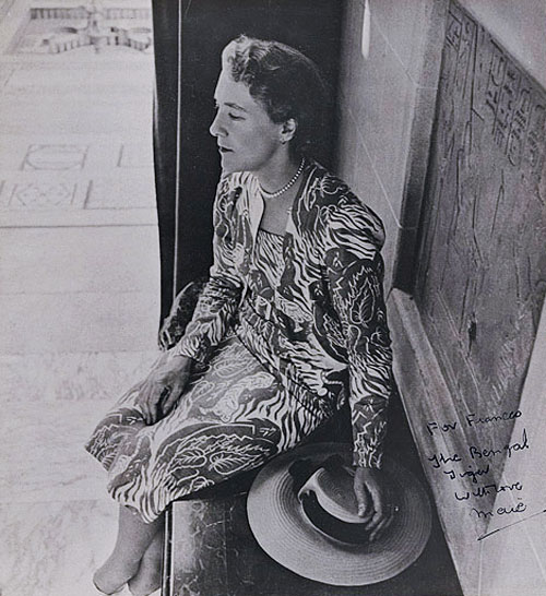
Image result for Photograph by Cecil Beaton of Maie Casey wearing a commissioned textile design “Bengal Tiger” by her lifelong friend Frances Burke, 1944.

Photograph by Cecil Beaton of Maie Casey wearing a commissioned textile design “Bengal Tiger” by her lifelong friend Frances Burke, 1944. 

In the 1930’s Nautical inspired patterns started to become popular within the textile industry. Bourke’s patterns were inspired by Australia’s beautiful environment and flourished with this upcoming trend. She designed some of her first patterns after viewing art at the Museum of Victoria by Margaret Preston.  

These earthy and sea inspired patterns lead to her popularity in 1937 when she established Burway Prints with her fellow Technical College graduate Morris Holloway.

Burway Prints originally screen printed Bourke’s minimalist designs on linen and was one of Australia’s oldest registered screen printeries. In the 1940’s Burway Prints switched from printing on linen to Japanese and Indian cotton. The 1940’s saw Burkes Aboriginal inspired prints gain popularity along with previously used earthy tones. 

“Crete” Screen printed, Frances Burke Fabrics Pty Ltd, Victoria, Australia, 1948

The creation of Burway Prints was encouraged by Pierre Fornari the fashion director of Georges department store. Burke had her own clothes made at the department store and they were looking for new and fresh prints due to the lack of supply and variety from local suppliers. She saw a gap in the market for simple patterns that represented Australia’s natural beauty.  

Her career really took off in World War Two due to the limited supply of imported fabrics from Europe.

Australians financially were burdened by the war and were in need of an affordable option to imported textiles. Architects began to commission work from her such as Roy Grounds, Guilford Bell, Robin Boyd and Richard Haughton. This lead to her commission of designs for commercial buildings such as Government House, Civic Theatre, State Library of Victoria and six different hospitals in Melbourne. 

“Totem” Screen printed, Frances Burke Fabrics Pty Ltd, Victoria, Australia

In 1948 Burke continue her career through the establishment of the Good Design Shop, later changing the name to New Design. She sold her textiles as well as modern furniture and homewares from Australian designers such as Grant Featherston and Clement Meadmore. Up until 1967 various stores where successfully trading in Australia.  

After this time when the war finished Burke began frequent travel to the United States, United Kingdom, Europe, Japan and Taiwan. Whilst travelling she learnt about new and different design trends from around the world and brought her knowledge back to share with Australia.  

“Waratah” Screen printed, Frances Burke Fabrics Pty Ltd, Victoria, Australia, 1942

Burkes bright and minimalist textile patterns have made a name for not only Australian designers but female designers. Her career really took off in a time of male dominated industries and she has successfully asserted herself among the best textile designers of her time. 

Bourke became a great advocate for the design industry in Australia. She was heavily invested in associations such as The Contemporary Art Society (1938), The Society of Industrial Designers (1947), council member of The Museum of Modern Art and Design of Australia (1958-1966) and president of The Arts and Crafts Society of Victoria (1968-1971). 


Written by Jasmine Thompson

MINIMALISM STYLE | Kate Batten

I’ll say it, I love Minimalism. It’s a design style that encourages a lifestyle. It’s not for everyone, but it works it’s magic on people feeling a little weighed down by All. The. Stuff. Fear not cushion lover. Minimalism is a style that can be adapted to suit your current lifestyle, including your plush pillows.


THE INITIAL CULL 

To get started on your new minimalist interior (and life!), there is an essential step: the clean out. Getting started is the hardest part. Set some guidelines for what you will and won’t keep. The two most important rules most minimalists adopt are: does this item bring me joy or is this item useful? If the item can satisfy one or more of those criteria, it stays and, on the flipside, if it doesn’t satisfy the criteria, it’s got to go! There’s so much satisfaction in knowing that your home is a carefully curated sanctuary, perfectly reflecting your needs and interests.


QUALITY OVER QUANTITY 

Minimalism isn’t about throwing away all your earthly possessions and feeling deprived. You absolutely should keep the items you love but ensure that items you don’t cherish anymore (or didn’t even to begin with) aren’t sticking around and weighing you down. Invest in quality pieces that you can see yourself keeping for 20 years. Sure, the initial outlay of money is greater, however choosing a style that is simple (and most importantly, that you love!) will ensure longevity and work out more economical in the long run. 

SIMPLE COLOUR PALETTE 

To get the most out of your newly refreshed space, keep the colour palette simple and cohesive. Note: this doesn’t rule out colour. Greys, blues and greens work a treat in minimalist interiors as they are calming, but still somewhat visually stimulating. Keep your furniture quite neutral in colour, adding colour by using art and soft furnishings. 


WARM UP WITH TEXTURE 

Minimalist interiors can be interpreted as cold or harsh without the addition of the right soft furnishings. Adding colour and texture using soft furnishings will create an inviting and comfortable atmosphere. The right balance of textiles is essential as if you use too many in the space, it’s not really minimalist anymore. Carefully edit the space but keep in mind the need for texture and warmth.

THINGS YOU LOVE 

I love to read so I love my books and the way they look. I find comfort in having them in my home.

Minimalism isn’t about owning nothing, its about valuing all your possessions and knowing they add to your life rather than burden it. Keep your spoon collection or your Superhero Figurines. These items tell a story of who you are and what you love, so feature them in your home.

Ultimately, minimalism is a choice to live life with less to enjoy more time with the things (and people!) you love. 


Research and written text by Kate Batten

SPOTLIGHT | the bigger picture project with bonnie gray

Say hello to Bonnie Gray and ‘The Bigger Picture Project’, where she collaborates with other artists to raise funds for the Gosford Shelter.

Designing and creating only 14 individaul Italian leather pieces with the utter most colour affection and hand crafted attention. Each case is created to only cause quickened inspiration for all artists, designers, writters, hairdressers and make up artists to create without delay. A leather rolled case that helps unroll creativity.

All moneys made from this project will go to the Gosford Shelter on the Central Coast. Helping the homeless, young and old off the central coast streets into there own homes.


A confetti sky shouting thankyou to all the stunning creatives that put these leather items together – Shakirra Rees and Jodie Mowczko and thankyou to the photographers and helpers Jacs Powell, Malamoon Suz and Amy Scott

Shop for your one of a kind case here

AWARD WINNING DESIGN | Graphic Design Students working with Inner City Winemakers

” When I was first asked if I would like to talk to Hunter Design School students I didn’t really know what to expect. I was asked to talk to the students about what we look for in a wine label and to give them a wine label design brief.

I gave them a brief for our 2016 Tumbarumba Pinot Noir. I made the brief very broad to give the students a very wide scope.
When I was given the finished designs it was quite overwhelming! Every Student produced a label that was very unique and refreshingly original. The only issue I had was choosing which label to use. They were all of a quality that you would expect from a professional designer.

I would like to congratulate Hunter Design School for producing such talented and capable graduates”.

Rob Wilce – Director/Winemaker.
Inner City Winemakers Wickham


Through Rob’s thorough review of each design, a design was chosen as the winning design to be used for the Pinot Noir label in 2017.


Congratulations to Mel Craig with her award winning label design.

Mel has been working wholeheartedly, experimenting with new techniques and styles to create an artistic design that reflects both the Inner City Winemakers and the Newcastle lifestyle. Below is her wine bottle label with suggested re branding design ideas.

mel-craig

We would also like thank Carl Morgan from Zoocraft for encouraging our graphic design students and commending them on their hard work.

Working from the inside out, Carl Morgan designs and administers creative events. Primarily working with his partner Lara in design studio Zookraft, the pair orchestrates custom graphic design, illustration and typography, strong on personality and thoughtful in concept. Additionally, Carl undertakes creative festival Look Hear. The festival invites leaders in the creative industries to help create platforms for creative professionals, students and creative-curious folk, through workshops, conferences, exhibitions and more. In his spare time, Carl likes to pass on what he knows, to up-and-coming designers in local creative institutions.

TILE DESIGN | Cert IV in Design Students designing for Earp Bros

Earp Bros offer a diverse range of tile products from around the globe. Located in Newcastle, Sydney, Melbourne and Brisbane (in 2017) we are proud to be a 5th generation, family-owned business with our Head Office in Carrington. Our Newcastle West Showroom loves to work with HDS and the next generation of Design Professionals in Newcastle.

A great deal of consideration, planning and procurement go into creating the Earp Bros range and we are pleased to be an exclusive importer of globally recognised brands such as Porcelanosa and Venis.

We also look to smaller, artisan manufacturers for our Bespoke range of Tile and Stone.

It was with this range of products that we invited students from HDS to develop a unique tile design and the opportunity for outstanding designs to be produced!

hexagons_web

Students were introduced to the world of cement tile, commonly known as Encaustics. These beautiful tiles are often inspired by nature, geometry and pattern and used extensively in homes, businesses and public places throughout the world.

Each tile begins with a design – a line drawing and a selection of colours. This design is crafted into a mould by artisan hands and then each tile is poured by hand. Pigments and cement are mixed to create a smooth liquid that fits to the mould and reveals the design. Layers of cement are built up to create a tile that is 16mm thick. It’s then hydraulically pressed and cured in a water bath.

Each piece of tile interacts with the next and allows the pattern to emerge and wander over wall and floor surfaces.

Students were asked to develop a tile for a client brief and the results were diverse, creative and inspired.

From designs featuring stripes and geometry, to organic forms inspired by nature, the tiles are a testament to the knowledge students have gained throughout their course.

Like any design challenge, there were some stand-out designs and two of the students will have their designs produced in 2017.


Congratulations to runner up, Laura Hamill for her design “Cake Anyone”. A simple yet effective triangular design with on-trend terracotta and pop colour highlights – a saleable, fun tile!

And a huge congratulations to Kayla Tesoriero for her design “Mind the Gap” inspired by London’s tube and the colours of Notting Hill and Hampstead. This is a highly original and creative design that will translate well into a repeat pattern tile design – well done!

We look forward to sharing the production journey with you next year!

Check out Earp Bros full range of cement tiles

img_0189

GREENERY | Pantone 2017 Colour of the Year

0ae05da88b9a6953c7258bc9cc0bd8d8

2037ba6fc25a67f7a69ec4f34f6698c4
A refreshing and revitalizing shade, Greenery is symbolic of new beginnings.

Greenery is a fresh and zesty yellow-green shade that evokes the first days of spring when nature’s greens revive, restore and renew. Illustrative of flourishing foliage and the lushness of the great outdoors, the fortifying attributes of Greenery signals consumers to take a deep breath, oxygenate and reinvigorate.

Greenery is nature’s neutral. The more submerged people are in modern life, the greater their innate craving to immerse themselves in the physical beauty and inherent unity of the natural world. This shift is reflected by the proliferation of all things expressive of Greenery in daily lives through urban planning, architecture, lifestyle and design choices globally. A constant on the periphery, Greenery is now being pulled to the forefront – it is an omnipresent hue around the world.
A life-affirming shade, Greenery is also emblematic of the pursuit of personal passions and vitality.

Read more about the colour of the year

Hello and Welcome! Register here before making an Application.